Popular Courses
Find My Course
0:00 / 0:00
Line of Best Fit
If the 2 variables in a scatter plot seems to be related, we often want to visualize the pattern/ trend. This can be done by drawing a line or curve that can represent the pattern.
If the pattern on a scatter plot seems to follow a straight line, we can draw a line of best fit to represent and help us visualize this relationship.

- If the line of best fit goes up and to the right, we say that the two variables have a positive correlation
- If the line of best fit goes down and to the right, we say that the two variables have a negative correlation
- If there doesn't seem to be a pattern and we can't draw a line of best fit, we say that the two variables have no correlation
Note
If the data points follow a line exactly, then we have a linear relation!
Drawing a Line of Best Fit
You want to make sure that the line follows the trend of the points, and is visually "between" all of the points.

Predictions Using the Line of Best Fit
Once we've drawn the line of best fit, you can use 2 points on the line to determine the equation of the line. Then, you can predict the dependent variable given the value of the independent variable (and vice versa):
- Interpolation: when we are trying to predict data that is within the given variable values

- Extrapolation: when we are trying to predict data that is outside the given variable values

Practice: Trends and Lines of Best Fit
Identify the type of correlation (if any) between the independent variable (on the horizontal axis) and the dependent variable (on the vertical axis) in the following scatter plots.
a)

b)

c)

d)


0:00 / 0:00
Example: Line of Best Fit
The following table shows the average monthly spendings of students at a certain school organized by age. The average spending for 16 and 19 year olds at this school are missing.
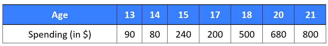
a) Create a scatter plot to represent this data, then sketch the line of best fit.
The independent variable is age, and the dependent variable is the monthly spending.
Since the monthly spending start at 90 and go up to 800, let's set the y-axis to go up by 100 at a time.

The line of best fit you draw might look slightly different than the one in this solution. The key thing to remember is that the line of best fit should be somewhat in the "middle" of all of the points (the data points on either side of the line should look "balanced").
b) Find the equation of the line of best fit
Let be the age of the student and be their average monthly spending.
Pick two points on the line of best fit: and .
The slope is
Substituting the slope and one of the points into the equation :
Therefore, the equation of the line is .
c) Use the equation you found in b) to approximate the average monthly spending for 16 year old students at this school.
We want to substitute into the equation :
Therefore, using the equation of the line of best fit, we approximate that a 16 year old studnet at this school will spend an average of $275 per month. This is an example of interpolation because is between and , which are values given in the table of values.
d) Use the equation you found in b) to estimate the age of a student who spends an average of $350 per month.
We want to substitute into the equation :
Therefore, using the equation of the line of best fit, we approximate that a 17 year old student at this school will spend an average of $350 per month. This is an example of interpolation because is within the data points given in the table of values.
*Notice that from the table, we saw the data point years old and . But since the line of best fit takes into account all data points and not just this particular one, we got a different approximation for compared to the data point found in the table.
e) Use the equation you found in b) to esimate the average weekly spending for a 22 year old student.
We want to substitute into the equation :
Therefore, using the equation of the line of best fit, we approximate that a 22 year old studnet at this school will spend an average of $775 per month. This is an example of extrapolation because is outside of the data points given in the table of values.
Practice: Line of Best Fit
The following table shows us the population (rounded to the nearest 10,000) of Canada and 3 select provinces over an 8 year period.

Here are the equations of the lines of best fit:
where represents the year and represents the population (in people).
Based on the equations of the lines of best fit, which of the following has the slowest population growth?

0:00 / 0:00
Outliers
Outliers are data points that don't seem to follow the same trend as the other data points.
After you draw in the line of best fit, outliers are the points that appear to be furthest away from the line.
Examples
Circle all outliers (if any) from the graphs below.

The point that is furtherst to the bottom right may be considered an outlier.

The 2 points that are furthest to the top left may be considered outliers.