Wize High School Grade 9 Math Textbook > Investigating Relationships
Correlation, Interpolation & Extrapolation
Popular Courses
Find My Course
0:00 / 0:00
Correlation
If the 2 variables in a scatter plot seems to be related, we may wonder what type of relationship they have and what's the strength of the relationship.
Scatter Plot Examples
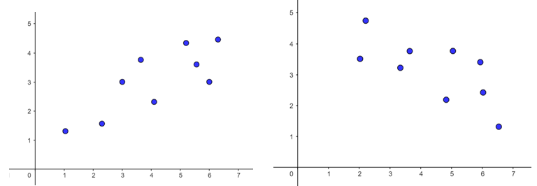
List anything you notice about the following scatter plots:

There is no wrong answer! Here are some examples of things that you may have though about:
- "I like that colour of blue for those dots"
- "All of the graphs have the same number of points"
- "The points on some of the graphs look like they form a pattern, they are closer together"
- "The points on some of the graphs look like they go up and to the right, and in other graphs, they look like they go down and to the right"
Correlation is when there appears to be a relationship between two variables. We way that the variables are correlated.
Types of Correlation
- If the data points go up and to the right, we say that there is a positive correlation
- As one variable increases, the other variable also increases

- Example: The more water a plant gets, the taller it grows. There is a positive correlation between the variables amount of water () and height ()
- If the data points go down and to the right, we say that there is a negative correlation
- As one variable increases, the other one decreases
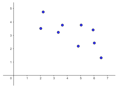
- Example: The more painters you have, the less time it will take to paint a house. There is a negative correlation between the variables number of painters () and painting time ()
- If there doesn't seem to be a pattern or relationship, we say that the two variables have no correlation.
Strength of Correlation
If the data points appear to have a positive or negative correlation, we can then measure the strength of the relationship.
- Strong correlation: when the data points seem to behave more like a straight line

- Weak correlation: when the data points appear to have a positive or negative correlation (there is a general pattern or trend), but they don't quite line up as a nice straight line
Practice: Trends and Lines of Best Fit
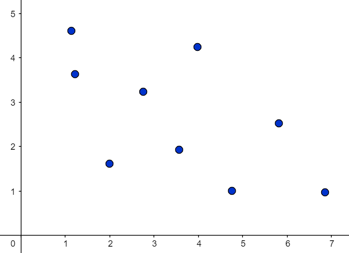
Identify the type of correlation (if any) between the independent variable (on the horizontal axis) and the dependent variable (on the vertical axis) in the following scatter plots.
a)

b)

c)
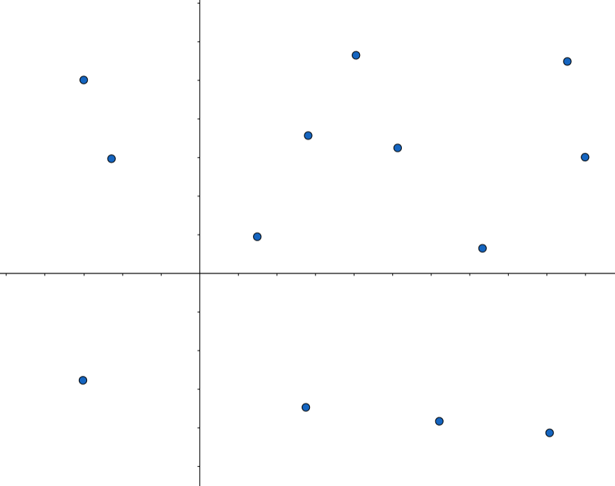
d)
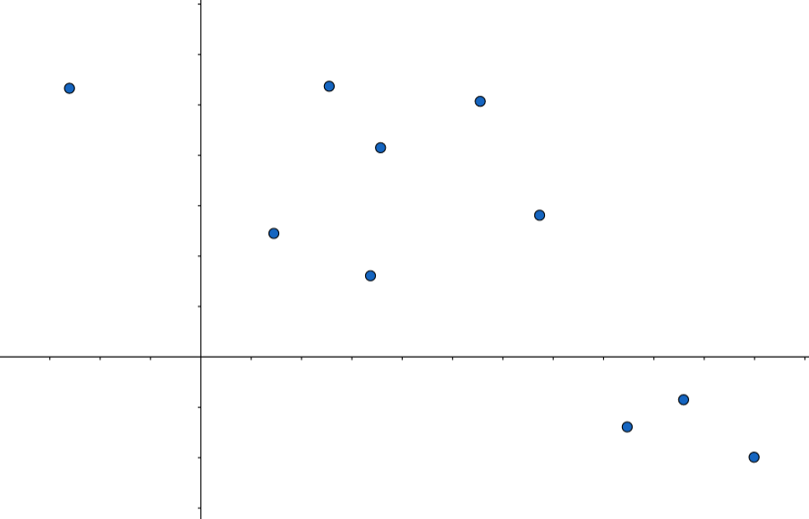
Practice: Strength of a Correlation
Match the following scatter plots with the correct descriptions of their correlations.
A.
Strong correlation
B.
No correlation
C.
Weak correlation


0:00 / 0:00
Interpolating & Extrapolating
If two variables appear to have a positive or negative correlation, especially when it's a strong correlation, then the data points follow a linear relation.
We can predict the value of other data points by sketching in a line that fits with the data -- this is called the line of best fit.
Interpolation: when we are trying to predict the value of a data point that is within the range of the data we have

Extrapolation: when we are trying to predict the value of a data point that is outside the range of the data we have

Example
The follow scatter plot shows the relationship between the amount of water in liters a plant gets (horizontal axis) VS the height of the plant in inches (vertical axis).
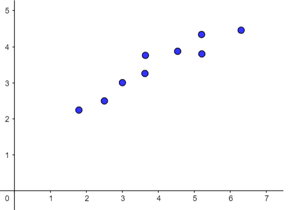
a) Use the scatter plot to predict the height of a plant that gets 5.8 L of water. Is this an example of interpolating or extrapolating?
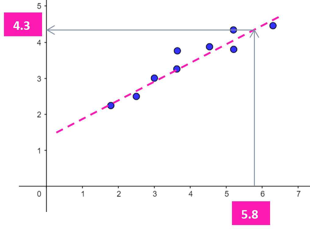
By sketching in a line that follows the patter of the data points, we see that a plant that gets 5.8 L of water should be around 4.3 inches tall. Since 5.8 is within the range of the given data, this is an example of interpolating.
b) Use the scatter plot to predict the height of a plant that gets 0.5 L of water. Is this an example of interpolating or extrapolating?
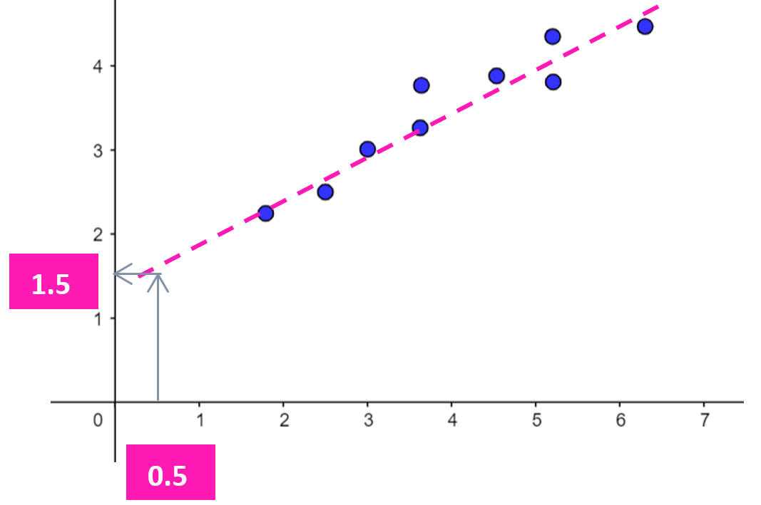
By sketching in a line that follows the patter of the data points, we see that a plant that gets 0.5 L of water should be around 1.5 inches tall. Since 0.5 is outside the range of the given data, this is an example of extrapolating.
0:00 / 0:00
Example: Extrapolating & Interpolating
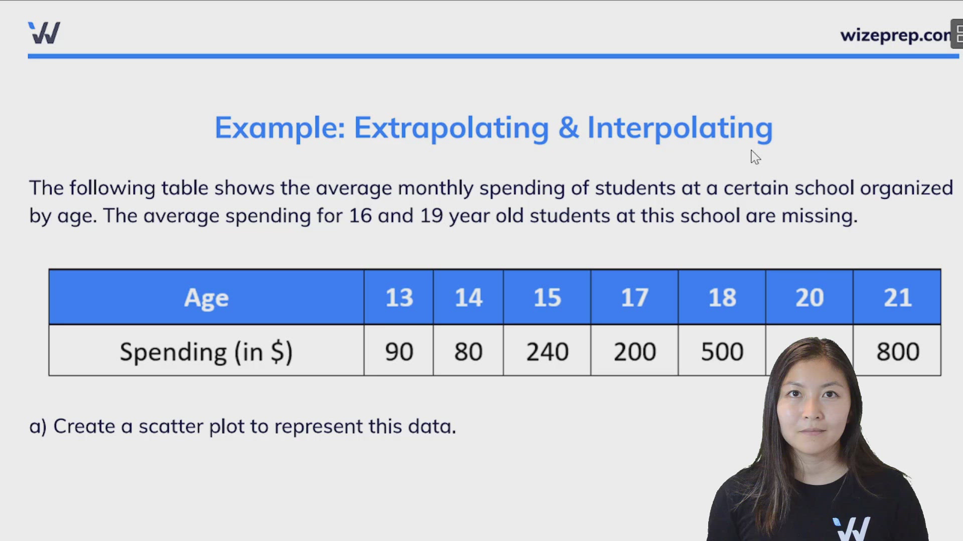
The following table shows the average monthly spending of students at a certain school organized by age. The average spending for 16 and 19 year old students at this school are missing.

a) Create a scatter plot to represent this data.
The independent variable is age, and the dependent variable is the monthly spending.
Since the monthly spending start at 90 and go up to 800, let's set the y-axis to go up by 100 at a time.

The orange line is called the "line of best fit". It can help us interpolate or extrapolate data.
b) Approximate the average monthly spending for 16 year old students at this school. Is this is an example of interpolation or extrapolation?
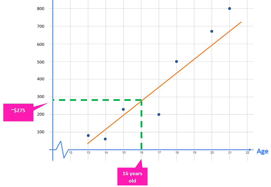
Using the scatter plot and the line of best fit, we can approximate that 16 year old students will spend around $275 a month.
In our data set we are given data points for 15 and 17 year old students, since 16 year old students are in between these two ages, this is an example of interpolation.
c) Estimate the age of a student who spends an average of $350 per month.
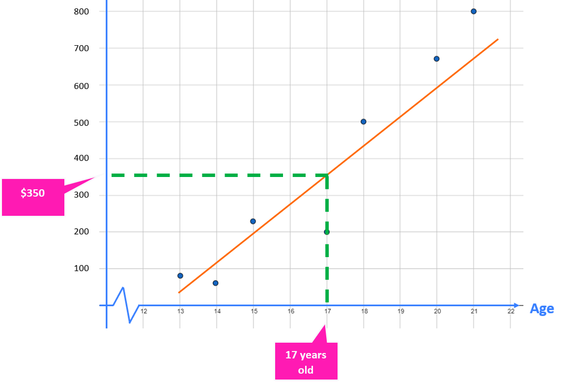
Using the scatter plot and line of best fit, we can estimate that 17 year old students spend an average of $350 per month.
In our data set, a data point for a 17 year old student was given. So, this is an example of interpolation.
*Notice that from the table, we saw the data point years old and . But since the line of best fit takes into account all data points and not just this particular one, we got a different approximation for compared to the data point found in the table.
d) Estimate the average weekly spending for a 22 year old student.
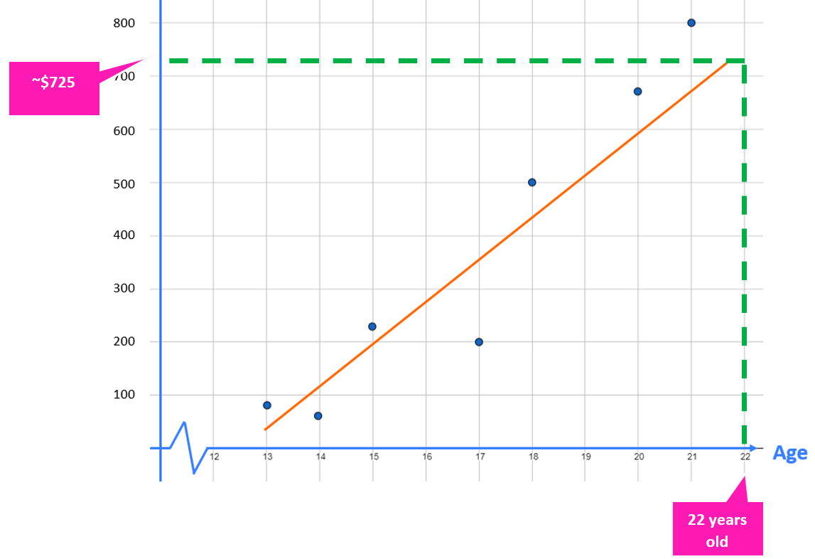
Using the scatter plot and line of best fit, we can estimate that a 22 year old student will spend on average $725/month.
In our data set, the data point with the highest age is 21 years old. Since 22 years old corresponds to a data point that is outside what is provided in our data set, this is an example of extrapolation.
Practice: Extrapolation & Interpolation
The following table shows us the population (rounded to the nearest 10,000) of Canada and 3 select provinces over an 8 year period.

Here are the equations of the lines of best fit:
where represents the year and represents the population (in people).
Based on the equations of the lines of best fit, which of the following has the slowest population growth?