Popular Courses
COMM 214
Concordia University
AP Statistics Exam Prep Course
AP Exam Prep
Statistics
General Course
Intro to Statistics
University Study Guides
COMM 215
Concordia University
Algebra I
US High School
STAT 213
University of Calgary
COMM 191
University of British Columbia
DATASCI 1000A/B
Western University
STA 100
University of California - Davis
Grade 12 Data Management
Ontario High School
High School Statistics
US High School
STATS 2244A/B
Western University
Intro to Statistics
University Study Guides
STATS 2035
Western University
STAT 161
University of Alberta
QMS 210
Toronto Metropolitan University
STAT 263
Queen's University
ECON 221
Concordia University
STAT 251
University of British Columbia
0:00 / 0:00
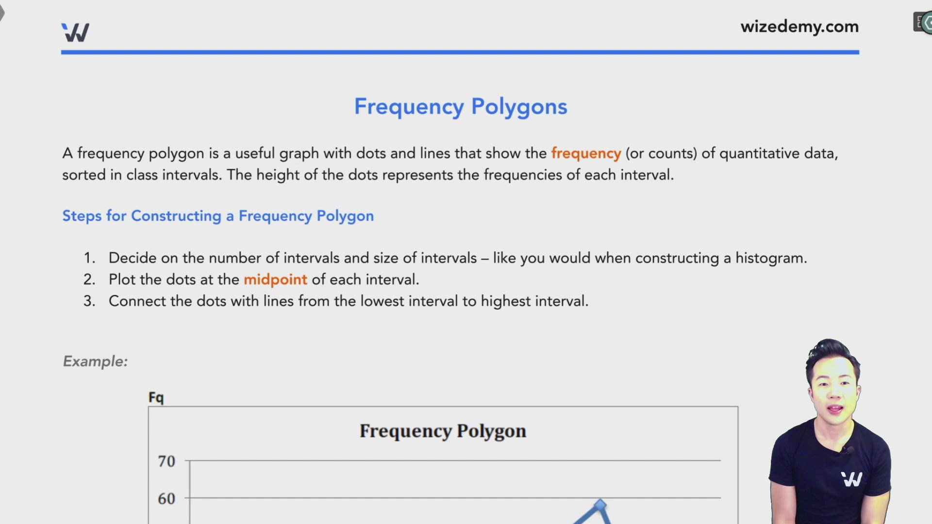
Frequency Polygons
A frequency polygon is a useful graph with dots and lines that show the frequency (or counts) of quantitative data, sorted in class intervals. The height of the dots represents the frequencies of each interval.
Steps for Constructing a Frequency Polygon
- Decide on the number of intervals and size of intervals – like you would when constructing a histogram.
- Plot the dots at the midpoint of each interval.
- Connect the dots with lines from the lowest interval to highest interval.
Example:

Cumulative Frequency Polygon
A cumulative frequency polygon is just like a frequency polygon except that the intervals add up to 100% of the data from lowest to highest.
An interval contains the frequency of its own interval plus the sum of the frequencies of all the intervals that are smaller than it.
Example
Here is a cumulative frequency polygon for the average grade of students:

Practice: Frequency Polygon
Here is a cumulative frequency polygon for the average grade of students.
Linda’s average grade is 60%. Is she smarter than half the undergraduate students?