Popular Courses
AP Statistics Exam Prep Course
AP Exam Prep
Statistics
General Course
Intro to Statistics
University Study Guides
Algebra I
US High School
DATASCI 1000A/B
Western University
STA 100
University of California - Davis
Grade 12 Data Management
Ontario High School
High School Statistics
US High School
Intro to Statistics
University Study Guides
STAT 161
University of Alberta
ECON 221
Concordia University
STAT 251
University of British Columbia
STATS 2B03
McMaster University
COMM 162
Queen's University
Grade 12 Statistics
Canada High School
MATH 203
McGill University
STAT*2060
University of Guelph
BIOL 243
Queen's University
PSYC 204
McGill University
STAT-2910
University of Windsor
0:00 / 0:00
Dot Plots
The dot plot is a graph that consists of data points that are vertically illustrated with dots. Typically, one dot is one count or frequency. The height of each set of dots indicates how many counts fall within a class interval.
A dot plot may be assessed like a bar graph, histogram, and stem-and-leaf plot because they all have frequency in the y-axis.
Note that bar graphs are used for categorical data and histograms are used for quantitative data. Dot plots may be used for both.
Example
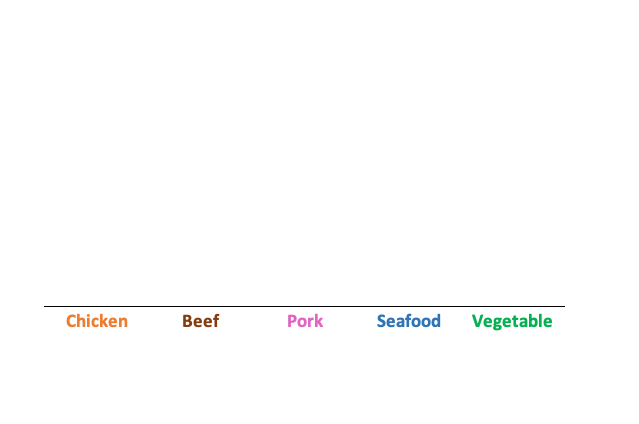
Dot plot with categorical data: favorite ramen flavor.
Chicken = 4 votes
Beef = 6 votes
Pork = 2 votes
Seafood = 8 votes
Vegetable = 5 votes
Example
Dot plot quantitative data: number of refunds made at a store on a given day (random variables X=0,1,2,3...)
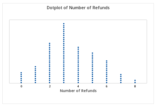
Without access to software, you will need to draw a dot plot by hand so it work best without too many counts in total.
Wize Tip
With dot plots displaying quantitative data only, you can assess the center, spread, and skewness.
Portions of information contained in this publication/book are printed with permission of Minitab, LLC. All such material remains the exclusive property and copyright of Minitab, LLC. All rights reserved.
Practice: Dot Plots
Which of the following is true about dot plots?