Popular Courses
COMM 214
Concordia University
STAT 151
University of Alberta
AP Statistics Exam Prep Course
AP Exam Prep
Statistics
General Course
Intro to Statistics
University Study Guides
COMM 215
Concordia University
Algebra I
US High School
STAT 213
University of Calgary
COMM 191
University of British Columbia
DATASCI 1000A/B
Western University
STA 100
University of California - Davis
Grade 12 Data Management
Ontario High School
High School Statistics
US High School
STAT 200
University of British Columbia
Intro to Statistics
University Study Guides
STATS 2035
Western University
STAT 161
University of Alberta
QMS 210
Toronto Metropolitan University
STAT 263
Queen's University
STAT*2040
University of Guelph
0:00 / 0:00
Pie Chart
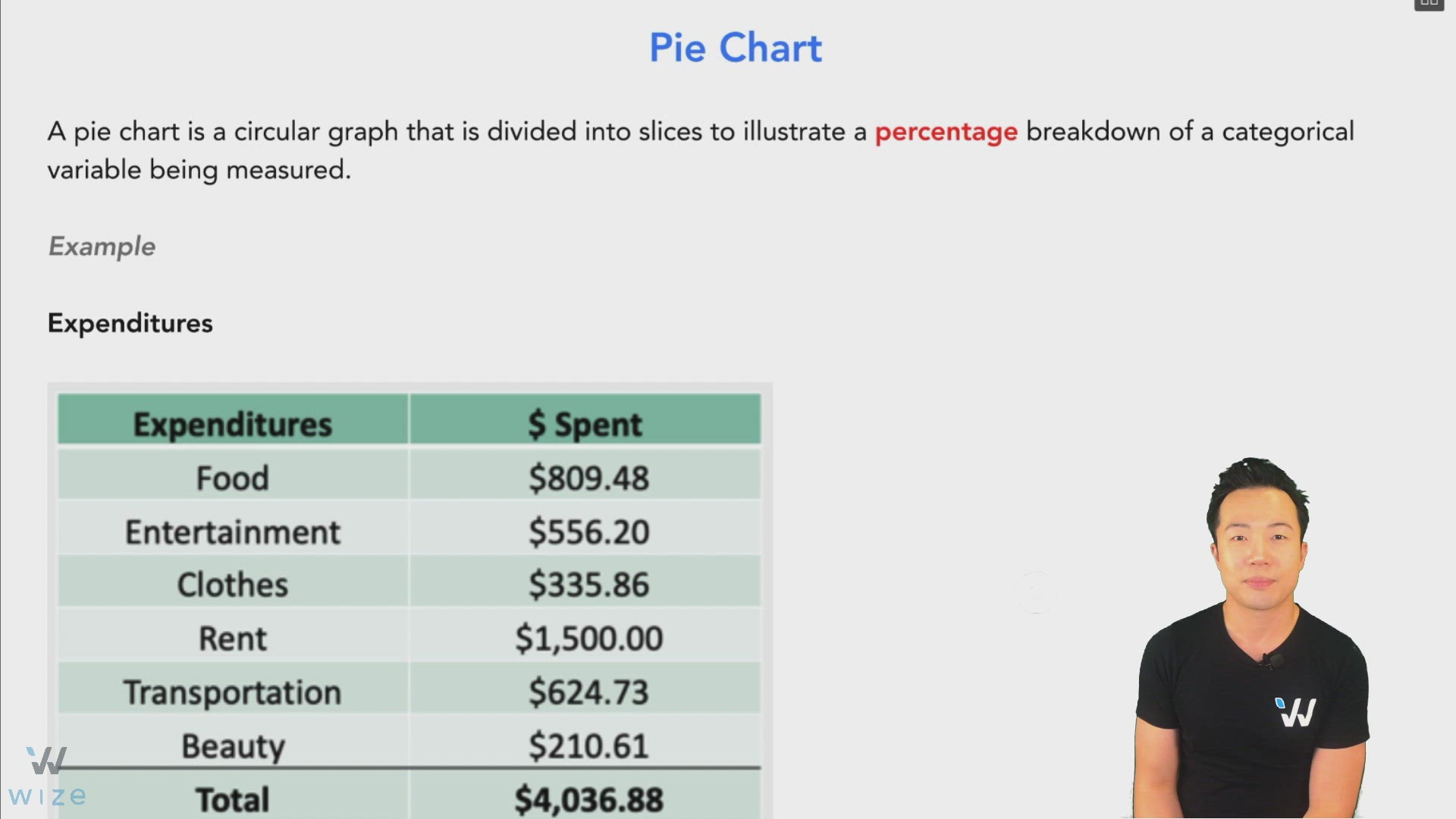
A pie chart is a circular graph that is divided into slices to illustrate a percentage breakdown of a categorical variable being measured.
Example
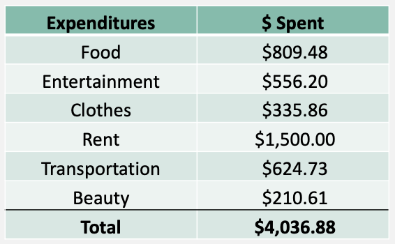
This pie chart gives us a clear visual of this person’s expenditures.

Watch Out!
Make sure that all the slice add up to 100%
What is the pie chart lacking?
- Can see % of spending for each category but can’t see how much is actually spent in $.
- Doesn't show total $ expenditures, just 100%.
Practice: Pie Chart
What is wrong with this pie chart?
